Healthcare · Student Project 02

SwiftCare — On-demand Healthcare Access

A mobile-first healthcare access app focused on the moment that matters most: a first-time user in an urgent situation. The design centres on trust, clarity, and speed — getting from "I need help" to "help is on the way" in as few steps as possible.

Role

Designer · Researcher

Type

Mobile health app concept

Period

2023 · Tongji D&I

Tools

Figma · Service blueprinting

SwiftCare

01 / The Problem

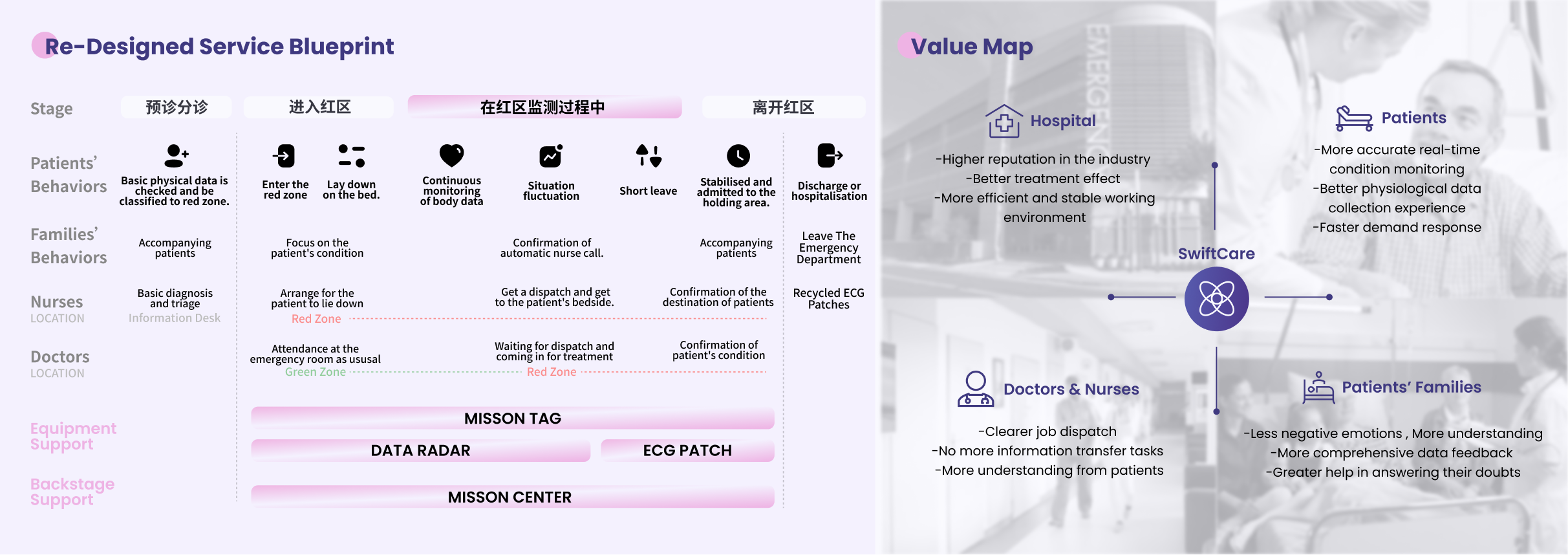
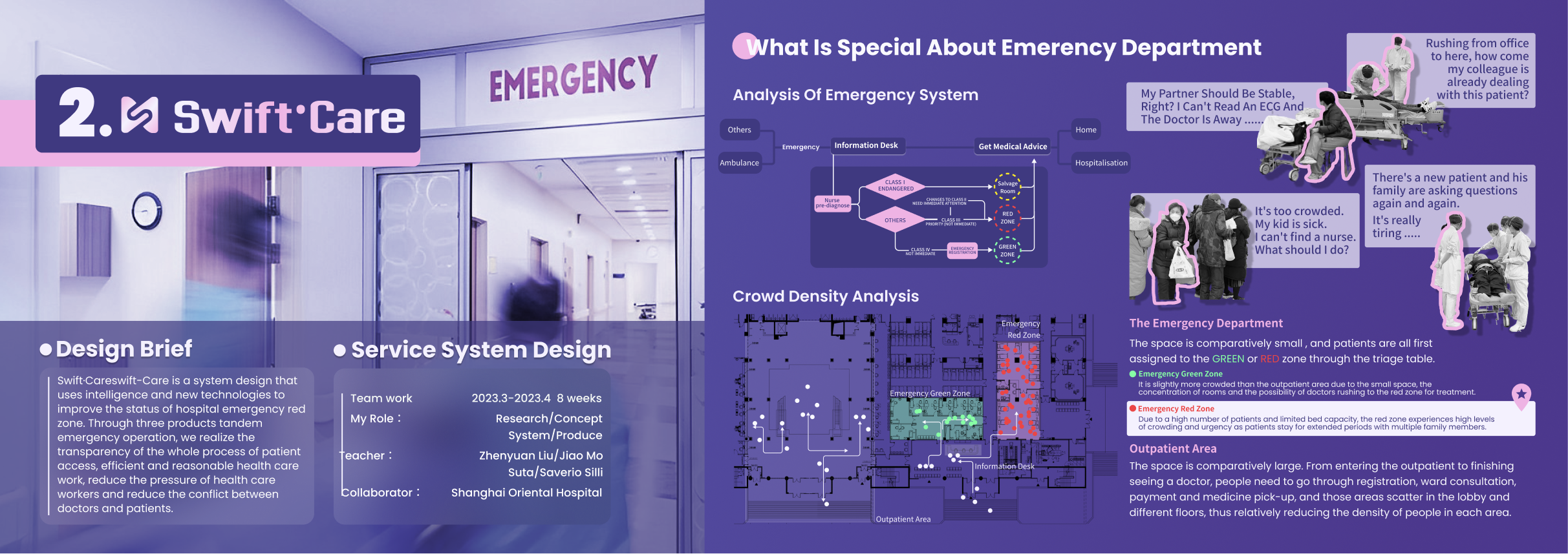
The hardest moment in healthcare is the first one.

Most healthcare apps are designed for routine maintenance — checking lab results, booking annual appointments, paying bills. SwiftCare set itself a harder problem: what does the experience look like for someone who has never opened the app, doesn't know what kind of care they need, and is stressed?

Trust, in this context, isn't a brand value — it's an interaction quality. Every moment of confusion, every unnecessary form field, every unclear next step is a direct cost.

02 / Approach

Triage as a conversation, not a form.

Rather than ask the user to self-diagnose into a category, SwiftCare's onboarding uses a guided triage flow — short, plain-language questions that map symptoms to service options behind the scenes. The result is a single confident recommendation with clear secondary options.

Design principle

Trust grows in the gap between expectation and experience. Every screen of SwiftCare aims to deliver slightly more clarity than the user expected.

03 / Reflection

Designing for strangers.

SwiftCare reinforced something I've seen across every product since: the most important user is the one you'll never speak to. The first-time user doesn't have the context to ask good questions, doesn't know what's possible, and won't come back if the first encounter feels off.

Designing for that user shapes everything — copy, hierarchy, error states, the tone of the empty screen. It's a discipline I carried directly into the consumer side of my Disney work.