Mental Health · Student Project 03

TherapyEase — Reducing Friction in Therapy Access

A calm, accessible app for finding and booking mental-health support — designed to feel approachable at the moment someone most needs help. The work focused on the emotional texture of the experience as much as the functional flow.

Role

Designer · Researcher

Type

Mental health app concept

Period

2023 · Tongji D&I

Tools

Figma · Empathy mapping

TherapyEase platform overview

01 / The Gap

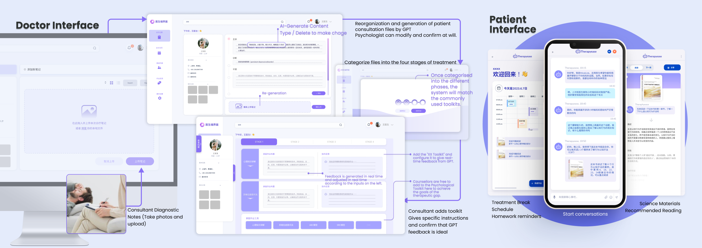
The friction is rarely functional.

Booking therapy isn't usually blocked by a missing app. It's blocked by hesitation — "Is this serious enough?", "What kind of help do I even need?", "What if it's too expensive?". By the time someone opens an app, they've already crossed a threshold most products don't acknowledge.

TherapyEase was an exploration of how digital design can meet that emotional state — not by being clinical or bubbly, but by being steady.

02 / Approach

A steady visual register.

Soft purples and rose tones — the colour language of dusk rather than dawn. Generous spacing, slow micro-animations, and large touch targets. Copy that validates rather than instructs ("Take your time" rather than "Please complete").

Tone

If a friend recommended a therapist over coffee, this is the tone the app aims to match. Warm but not performative. Helpful but not pushy.

03 / Reflection

Visual tone as a usability question.

For most products, visual style is decoration on top of structure. For TherapyEase, tone is the structure. A button that's the wrong size or colour can land as pressure rather than help; a microcopy phrase that's too brisk can derail a flow more decisively than a missing feature.

The project changed how I think about visual systems. They aren't just style — they're the texture of the experience. That perspective directly informed how I approached Disney's consumer-side tools later.